Tips for Postcard Creators
Sell more cards by making cards collectors want to buy
Serious postcard buyers want a few things
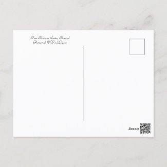
- They do want to see some identifying info printed on the back of the card. If you are showing a photo of the Pena Palace in Sintra, Portugal, put that information on the back of the card, so that your recipient will know exactly where the photo was taken. Also, leave plenty of room for the postcard buyer to write a message. Many people are buying these postcards because they want to send a very nice product to a penpal or a postcrosser in another country or another state or province. They are going to want to include a note, on a nice stretch of white space.
- Many postcard buyers would prefer, on the back of the card, a white background to a colored background. If you are going to use a colored background, consider posting another alternate product option in addition, one with a white back will appeal to postcard collectors.
- Postcard senders like great photos as much as the rest of us. They want an uncluttered well lit photo which shows the subject to best advantage. And unless you are making something artsy, or showing a misty scene, they want the photo to be in focus in the right spots. If you are snapping the shutter yourself for the postcard photo, you might want to consider positioning yourself between your subject and the sun. I come across many landmark photos where the background is bright and the landmark in dark and covered in shadow. Some photographers can use that to their advantage. But in a many cases, a dark subject is the unfortunate result of just not taking the time to find a better angle. In the case of the wren on the birdhouse, I could have just hauled myself out any time of day and snapped a quick pic. Instead, I waited until the light was right. This allowed me to get a well-lit image of the bird house and the wren(s) which looks awesome on a card.
- Use a big enough image. It's extremely important for Zazzle creators to use a large image, with plenty of pixels. And leave some room. When you take the photo, don't fill your viewfinder up so much. Be sure to leave some space around the subject. When you upload your image to the design tool, your photo dimensions may not match the dimensions of the card. Even if your photo does have the same aspect, you want to be able to stretch that image a nice little bit past the bleed lines. People who buy postcards online and then share their disappointment, have remarked more than a few times about receiving a postcard and finding white edge around part or all of the photo. By pulling the corners of your image to completely fill the bleed lines and then some, you will find your postcard will always print well and you could earn yourself a repeat customer.


Postcard Collectors Do Not Want to Buy
- Collectors do not want to see a generic postcard which fifty variations in text, one spelling out each state. Postcard collectors spend time looking for unique cards. Chances are they have seen that eye-catching emblem a thousand times with different city names or states on it. They don't want this.
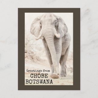
- Postcard buyers do not want to see unintended white around the edges of your card. To avoid having a photo which does not fill the printed card, enlarge your photo so that the photo extends OVER the bleed line on all edges. I see a lot of postcards where the photo will reach the end of the card in one direction, but has white edges on the other end. The top and bottom may have white strips, or the sides may have white strips, which many times will look unprofessional.When I had an amazing opportunity to photograph a bull elephant at the watering hole on the Chobe River in Botswana, I was super close, and my resultant photo was not in the right aspect for a postcard. Therefore, I added a brown border intentionally, so that the printed card would like like it's supposed to be this way.
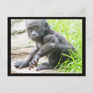
- Penpals and postcrossers do not want to receive a card which is so dark it has printed poorly. Some printing companies may correct for extra-dark splotches in the picture. Most won't. So that's up to you, the designer of the card. Use a well lit photo which is not full of overly dark areas. It's hard when your subject is dark, such as the adorable little Baby Bomassa Gorilla of the North Carolina Zoo in Asheboro. I lightened up the fur quite a bit before uploading this top-selling postcard, because I knew that having any large overly dark areas could result in a splotchy print. Black in the border seems to be okay. It's those dark areas within the photo which you want to watch for if you want your photo details to look defined and pleasing.
We all want buyers of our postcards to be happy with their purchases
By following some of the tips listed above, and more, people can offer postcards which are sure to please postcrossers across the world and the recipients of those cards. Whether you are designing a photo landmark card, an original art card, or a budget invitation postcard, much of the guidance here will apply.


Nice tips! What I got from your blog was that people want to see a title of the image on the back of the card. I may have to start doing that. Also, I LOVE the Asheboro Zoo in North Carolina. I live in North Carolina, so I always like going there!
ReplyDelete